


MY ROLES...
-
UX Design Lead
-
UX Researcher
-
UX/UI Designer
-
Usability Tester
PROCESSES
-
Competitive Analysis
-
User Research
-
User Personas, Flows & Journeys
-
Information Architecture
-
Wire-framing & Prototyping
-
Usability Testing
TIMEFRAME
-
7 months fulltime (2019)
TOOLS
-
Adobe XD
-
Balsamiq
-
Optimal Workshop
-
Card Sorting
-
Affinity Mapping
THE CHALLENGE...
To create a user centred web application that allows users to explore inspirations for tattoo designs according to their own personal preferences, e.g. artists or style.
Below I want to illustrate from start to finish my design process, within the context of building an application.


01 - discover & define
PROBLEM STATEMENT
“Users need a way to search for designs, artists, prices, advice, etc and help with the overall process of getting a tattoo in one single place, because maybe they don't have experience with the process of getting a tattoo or they just don’t have much time to commit to going through lengthy searches.”
“We will know this to be true when we see the number of app downloads and account creations increase and positive reviews from our users.”
POSSIBLE PROBLEMS
-
People don’t know what tattoo/design they want, they need inspiration.
-
They don’t know where about they want a tattoo on their body.
-
They have a budget range for a tattoo.
-
People don’t have time to visit studios and ask for prices, advice, etc.
-
Inexperienced people do not know the process of getting a tattoo & are worried/scared.
-
They don’t know which are the best local artists or studios.
POTENTIAL SOLUTION
A potential solution for our problem is an app which brings together solutions for our tattoo wanters in one centralised place. They can search for local tattoo artists and studios, read reviews of them, get prices and even connect directly with the artists to build up a better relationship with them. They can search through many existing tattoo designs and even create mock-up images of themselves with a design in order to help them decide. Potentially this also works both ways, as it helps the tattoo artists to promote their work to.

I gathered information about several competitors like Inkhunter,
Tattoodo, Tattoo Designs and Ink Squad to see how they
approached the issue.
This enabled me to spot weaknesses in their user experience and to
identify opportunities in the market.
My goals were to make better-informed decisions and to develop a
strategy that makes my product stand-out against competitor offerings.
Therefore, I used different methods:
Competitor Profiling, SWOT Analysis & UX Analysis.
Competitive Analysis
Inkhunter


There's already an existing and crowded market, with some good apps. We need to make sure ours will stand out from the rest.
In order to meet our user requirements, they should be able to find a suitable tattoo design and be able to communicate with artists & like-minded. It will also need to appeal to them aesthetically, functionally and overall give them a good experience.
Bearing all that in mind the main functionality of the app will include…
-
Search feature for tattoo designs, artists & studios
-
Large database of tattoo designs, ability to download/upload designs & save to favourites
-
Ability to connect & chat to artists & vice versa
-
Option to preview a tattoo design on themselves
To ensure all of this a strong marketing campaign would be beneficial, focusing on the personal aspect of the connection
between the customer and the artist.
INITIAL GOALS AND REQUIREMENTS
02 - UNderstanding the user
USER RESEARCH
In order to gain deeper insights about Second Skin's future users I conducted multiple user surveys and I interviewed 4 participants, my research goals being...
-
To get a better overall feel of who our prospective market audience are, e.g. age range, profession, status, etc.
-
To get a better idea of how popular tattoo design apps actually are during the process of getting a tattoo.
-
To get an idea of what kind of features in general prospective users would like in a tattoo designs app.
-
What special features would specifically attract a user to use a tattoo design app.


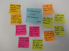


The interview participants were...
-
Between 20 - 50 years old
-
Have at least 1 tattoo, or are thinking of getting one
-
Use mobile applications or websites regularly.
Additionally, 48 surveys were completed. Participants were recruited on social media via tattoo related groups.
By using affinity mapping as a brainstorming tool to codify ideas, hypotheses, and predictions. It allowed me to identify themes and patterns from the interviews to create actionable steps to address pain points, concerns and needs of users.
Conducting Interviews & Surveys
KEY FINDINGS
A large majority of people have never used a tattoo app before (53%), or didn’t even know they existed (40%). However, 89% would consider using one.
-
Three popular reasons people selected for using a mobile tattoo app are…
o Inspiration for tattoo designs (75%)
o Connect with local tattoo artists or studios (50%)
o Gather info on the process of getting a tattoo (38%)
-
Other popular potential features are…
o Preview of tattoo designs on user’s body
o View artist’s work & design portfolios
o Appointment booking
o Review & ranking system for studios/artists
-
Having easy accessible information on the procedure of getting a tattoo and aftercare tips is something people are very interested in.
-
People definitely feel the ability to connect with local tattoo artists would improve their overall experience of getting a tattoo.
USER PERSONAS
Based on results from the interviews and surveys, I created 3 user personas to represent my target audience...
-
Phil, the 'ink lover'
-
Diana, 'the newbie'
-
Richie, 'the artist'

USER JOURNEYS
I created user journey maps to visualize the steps taken by the users as they engage with the application. This allows the capture of user's motivations, thoughts and needs in each step of the journey, it also helps us think of useful solutions that are appropriate for each.

USER TASK FLOWS
I carefully designed user flows to identify each step towards a user's task objective, thus ensuring the user's every need has been satisfied at every point of the user flow.

03 - ideation & prototyping
INFORMATION ARCHITECTURE
The design process is iterative. Based on all the user research done and information architecture principles, I constructed a basic site map for the app. Open card sorting was used to evaluate how the site map matches up with potential user flows.

Data Analysis - Card Sorting
Here I asked 3 participants to organise different content topics into categories that made the most sense to them. My aim being to discover patterns or trends so that I can organise the application content in the most logical way possible. This will ensure users can find the information they need on the platform quicker and easier.
After analysing all the results a few noteworthy discoveries made were...
• The 'Preview' category needs to be made clearer regarding what it actually is.
• Remove the 'News Feed' feature, it will now be the background of the Homepage.
• Add small description points for some of the different areas of the site, as without clarification they could easily be misinterpreted.
• Add a 'People' page to the 'My Area' section, as the following of other users is more important than first thought.
Amendments were made and we ended up with the final site design we see here...
WIRE-FRAMING & PROTOTYPING
At the start of the process I began with low-fidelity paper based sketches to focus on the core structure and navigation of the app, instead of wasting time on visual design features or complex functions.
I then moved onto digital mid-fidelity wire-frames made in Balsamiq, theses allowed me to show more detail and to get closer to the placement of UI elements and basic visuals.
The last step was to create a mid-fidelity prototype in Adobe XD, this expressed to a certain degree how the application was meant to function. The prototype was not fully functional, just the main user flows as discussed earlier.
This upfront work was quite lengthy, but was a good basis to gain user feedback for the upcoming test sessions.
Low-Fidelity Sketches - 'User finds & connects with an artist'

04 - testing & iteration
USABILITY TESTING
Here I created a usability test plan and tested my prototype’s usability and functionality, both with moderated in-person and moderated remote tests on potential users.
I gave them a set of tasks to complete and tested the ease and efficiency of completing those tasks. I observed where the users got confused with the product and granted insight on how to fix problems or errors.
The advantage of testing at this stage provides opportunity to spot possible issues before development. In addition, it allows me the chance to further strengthen the core features based on user feedback.
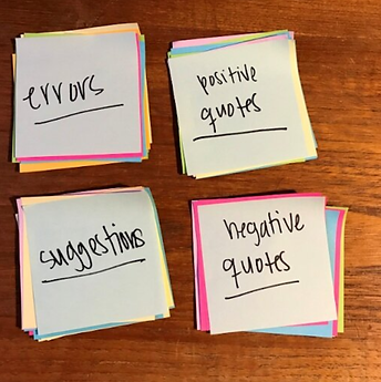
Again using the affinity mapping technique I sorted the results from the testing sessions into categories. Using a 'rainbow' style spreadsheet I was also able to rate & prioritise the issues by severity, as shown below...
-
Observations

-
Positive Quotes

Results Analysis - Main Issues Raised
• Error #1 - User has to 'follow' an artist in order to send them a message
(4-Catastrophic)
Resolution
Description
Currently a user must be 'following' an artist in order to be able to send them a message via the app. The rule was originally created to reduce spam messages & potential time wasting for artists. However, this was negatively brought up by 4 of the participants during testing.
Amend layout/design of the 'Follow' button & make social media icons more clear, e.g. move follow button away from icons & rename to something clearer.
• Error #2 - Issue with social media layout on artist's profile
(2-Minor Issue)
Description
Within the artist's profile page, the 'Follow' button (as mentioned in error#1) is directly above the social media icons the artist has links to. A number of participants were confused by this, they thought the 'Follow' was to follow the artist on these external platforms, not the app.
Resolution
Amend layout/design of the 'Follow' button & make social media icons more clear. E.g. move follow button away from icons & rename to something clearer.
• Error #3 - User was confused by the 'which are you?' question during signup
(3-Major Issue)
Description
At the beginning of the signup process, the user is asked the question, 'Which are you?' and is given the choice of 'Ink Lover' or 'Artist'.
On more than one occasion the participants mentioned that they either didn't understand the question and (or) that the layout of the screen was confusing. e.g. text & button positioning.
Resolution
Redesign the signup process for users/artists.
• Error #4 - A number of friction points on the homepage exist
(2 -Minor Issue)
Description
Although users were able to understand the Homepage screen elements easily and appreciated (most of) its content, there were a few minor points of friction on the screen...
- Bullet points are distracting, users attempted to click on them rather than the actual link
- Some objects are not in line with each other
- The large images for each section take up too much screen space, e.g. 'Trending Tattoos'
- Add more appropriate/suitable content
Resolution
Amend layout/design of the Homepage and fix the frictions points...
- Remove or reduce size of bullet points
- Align all objects & text were appropriate
- Add more appropriate content
- Replace the large single image, with multiple smaller ones where appropriate
• Error #5 - During on-boarding user can't swipe backwards to the previous page & is tempted to 'skip' whole thing
(3-Major Issue)
Description
The on-boarding process is meant to give the user as much info as possible in a clear & effective manner, all participants agreed this was the case. However, some wanted to go back to the previous screen to double check info.
Also we want the users to have as much info about the app as possible, the large 'Skip' button puts this at risk.
Resolution
Allow user to swipe backwards during the on-boarding process and to reduce the size of the 'Skip' button, so not as prominent and users are not as tempted to press it.
05 - refining the design
DESIGN PRINCIPLES
Here I have put into practice a number design techniques to refine and improve the app design, these include elements based on the 'Gestalt' principles of design and the guidelines for accessibility (WCAG).
And of course I have addressed the issues previously found in the usability testing sessions as well as creating a Design Language System to maintain consistency and structure to the overall app.

Visual Design Principles -
'Gestalt' Laws & WCAG
There are generally six individual principles commonly associated with the gestalt theory...
1. Similarity
2. Continuation
3. Closure
4. Proximity
5. Figure/Ground
6. Symmetry and order
If you stick to the ideas behind these principles your designs will feel more connected, coherent and complete and in turn will give the user a better experience.
Check out the slides to the right to see some examples of how I tried to incorporate these ideas along with WCAG guidelines.

Design Language System/Style Guide


DESIGN COLLABORATION
I reached out via slack channels for UX design peers, who had the same level of experience as myself and a couple of former colleagues who themselves are very experienced UX designers, as it would be good to get feedback from a professional perspective.
From the 6 participants I received 74 comments, the majority were constructive criticism and of course some positive feedback to. I have addressed each comment with my thoughts and explained any action I took.
Below are a few examples...
Splash Screen

POLISHING THE DESIGN
I think the more familiar a design is for the user, the better it is accepted. Throughout the project I tried to be creative during the development of the app, mainly trying to keep in line with my idea of the minimalistic, but still cool tattoo app, however feedback from testing has always bought me back to something that has been tried and tested before. Also, at whatever phase of design or development you are at, you can never forget about the purpose of the app and the main thing, the user.
Below are some examples of how the app's main screens adapted during phases of the development...
Screen Iterations - Splash Screen

06 - the final outcome
CONCLUSION
This project was a great learning journey for me. As I come from a QA background, I found a lot of overlaps between this and UX, in particular the early identification of issues and their resolutions, collaborating with development teams and the end users and the big importance of feedback and iterative development.
Don't just take my word for it though!
Please take a look my Second Skin demo presentation and also try the final prototype...
