MY ROLE(S)
-
UX/UI Designer
-
UX Researcher
PROCESSES
-
Competitive Analysis
-
User Interviews
-
User Personas, Stories & Flows
-
Information Architecture
-
Wire-framing & Prototyping
TIMEFRAME
-
5 days (March 2020)
THE CHALLENGE
To design an app where an employee can quickly/intuitively input their work expense claims to their employer.
The app will be used by all employees across an organisation. These employees will encompass a wide range of technical ability. They will range from having fluent technical skills all the way to basic knowledge. So, the design needs to be intuitive and work for all.
This whole task was to be completed within a time frame of 5 days. I would be using the standard 'double diamond' methodology and below I want to illustrate the basic fundamentals of my UX design thinking from start to finish.

TOOLS
-
Adobe XD

01 - the discovery phase
So considering this product is primarily aimed at the company employees, to make the job of entering their work expenses easier, we need to talk to potential users and and try to find out how they feel and what it is they actually want in a solution...
Goals...
-
Better overall feel of how our prospective users feel about the process of claiming expenses.
-
A idea of what people specifically like or don't like in expense claiming process.
-
An idea of what kind of basic features users would want in an expenses claiming app.
-
Better idea of any special or standout functionality that could improve the process.
Conducting User Surveys
-
Participant Scope - recruitment of random friends & family who have had first hand experience of claiming expenses from their employer.
-
Survey Platform - Google Forms, https://forms.gle/jA37jxCtuzX46aA6A
Main Findings & Takeaways...
The expense claimers...
-
A varied selection of professions and industries.
-
Majority classed themselves as 'expert' regarding technical knowledge.
How do they feel about it...
-
As expected, nobody enjoys it! They either just got on with it, or hated it!
-
The most popular reasons for people disliking the process were because of...
-
Approval process taking too long
-
Losing receipts
-
Generally don't have enough time to do it
-
Not understanding the process
-
-
A lot of people said an 'App' and the ability to scan receipts would help make the process easier

Use of existing systems...
-
The majority of existing systems have...
-
Ability to enter different types of expenses
-
Automatically calculate VAT
-
View & track previous claims
-
Manually upload receipts & evidence
-
-
Popular 'new' features people would like...
-
An 'app'
-
An integrated receipts scanner
-
-
As expected people didn't like their existing systems! But positives were...
-
Simple & easy navigation
-
Quick turnaround
-
Good support
-
-
To quickly sum up what employees wanted...
-
Simplicity
-
Receipt scanning ability
-
Claim tracking ability
-
The actual process of claiming...
-
The majority said they were familiar with their company's expense claiming process and support or help was readily available. Which was surprising!
- On average it takes most people 10-20 minutes to submit an expense claim
-
Popular suggestions to make this process quicker were...
-
An 'app'
-
Scanning of receipts
-
Reliable and easy contact with finance/approval team
-
Competitive Analysis
I'm not an expert in finance apps, so lets see what's already out there on the market. This will give me an idea of the basic features these kind of apps generally have, what functionality might be missing from them, their strengths & weaknesses and some general inspiration for my own application.


02 - defining the problem
Problem Statement
“Company employees need a quick and simple way to enter their work expenses, because this can be a difficult and time consuming task, which can easily go ignored.”
“We will know this to be true when we see an increase in the number of expense claims successfully submitted pro rata.”
Known Problems
-
People don’t have enough time.
-
Lack of technical ability/knowledge.
-
People don't like having to keep physical copies of receipts, they can easily get lost or defaced.
-
Long winded, tedious or complicated process.
-
People can get frustrated when there is a backlog of previously submitted claims and no clear info on their progress.
-
No technical or product support.
Proposed Solution
A potential solution for our problem is an app where...
-
Employees can quickly and intuitively enter their work expenses.
-
This should give all staff, no matter their level of technical knowledge the ability to easily enter different types of work expenses, upload receipts and other appropriate files, view info on previous claims and successfully submit new ones.
-
If extra support is needed this should be easily available.
Of course the user is always going to be our main focus, but from my experience of working closely with business requirements I also think it's important to keep in mind the business needs as well.
Having received the initial project brief, defined the problem/solution and combined with our market and competitive research, I drew up lists of business and system requirements from which we can base our designs on.
To view the business requirements document click here
User Personas
Based on results from our 'claiming expenses' survey conducted in the 'Discovery Phase', I created 3 user personas to represent our target audience...
-
Roy - 'The every day guy'
-
Jen - 'The busy professional'
-
Moss - 'The expert'

User Stories
I created user journey maps to visualise the steps taken by the users as they engage with the application. This allows the capture of user's motivations, thoughts and needs in each step of their expense claiming journey.

User Flows
Here I designed user flows to identify each step towards a user's task objective, from a perspective of if they were using the application/system, thus ensuring the user's every need has been satisfied at every point of the user flow.

03 - ideation & prototyping
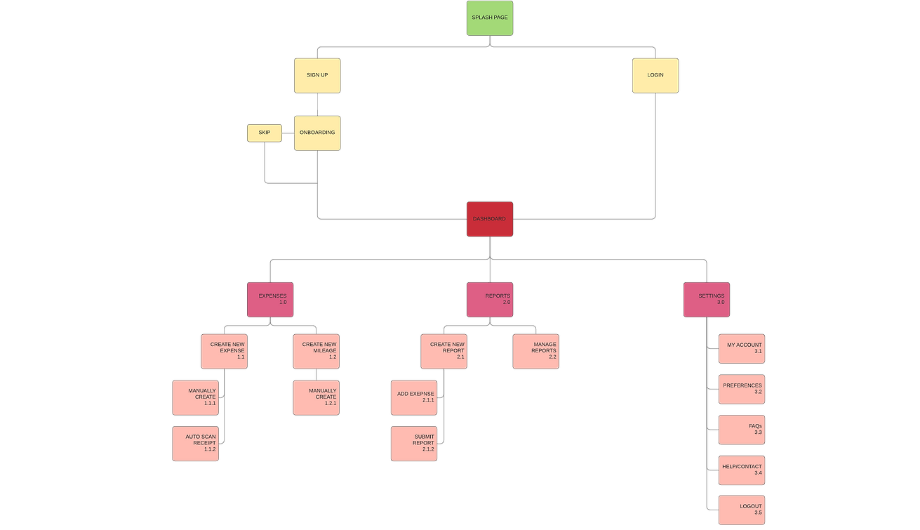
Based on all the user research done and information architecture principles, I constructed a basic site map for the application/system.
Normally we might have gone deeper into this design, e.g. using open card sorting to evaluate how the site map matches up with potential user flows, etc. However, time was limited and a basic, default design was chosen.
Information Architecture
.png)
Wireframing & Prototyping
After all the research done, it's now time to put everything together and give a visual shape to the process.
I sketched out designs for the fundamental elements for the system
-
Onboarding
-
Sign up & Login
-
Dashboard/Homepage
-
Settings menu


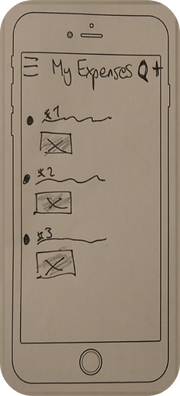

Due to time constraints, I decided to only produce mid-fidelity versions of the three example user flows shown earlier. Also normally at this stage we would begin usability testing on our designs to refine and filter out issues, but again this was not possible.

As we reach the end of our allotted time period, we are left with our high-fidelity screens and an MVP prototype.