


Visual brand & UI design
for personal banking
(responsive web application)
MY ROLES(S)
-
UI & Visuals Designer
PROCESSES
-
Brand identification & development
-
Moodboards
-
Style guides
-
Information Architecture
-
Lo-fidelity wireframing
-
Hi Fidelity Mockups
DATE
-
June 2021 (3 months)
BACKGROUND
-
The project was undertaken as part of completing a university accredited Professional Certificate in UI & Visual Design run by the UX Design Institute & Glasgow Caledonian University (3-6 months part-time).
PROJECT BRIEF
-
The brief was to create the UI for a challenger brand who is looking to make waves in the financial world with an intuitive, responsive web application for personal banking.
-
The UI & visuals were to be designed for 3 screens within the app, Main Screen, My Account, My Spending.
-
The UI design needed to adhere to a brand tone already established by the following brand principles:
-
Playful – using the product should be a joy for the User. A playful brand personality should come through but never at the cost of being intuitive.
-
Clear – as a banking application dealing with the User’s money, information must be presented in a logical and uncluttered way.
-
Trustworthy – the User must feel they can trust the product.
-
This involved coming up with a brand name + identity and designing new, polished User Interfaces across mobile, tablet and desktop screen sizes. This also involved UX redesign in terms of the functional layout and flow of the screens in question
TOOLS
-
Figma
MY PROCESS
-
My design process leading to x3 sets of final UI designs (mobile, tablet & desktop) is detailed below.

1. MOODBOARDS & REFERENCES
Firstly I created Moodboards in relation to the 3 brand guidelines given, these would later help to inspire the screen design for the banking platform.
Playful (aka creative), Clear, Trustworthy


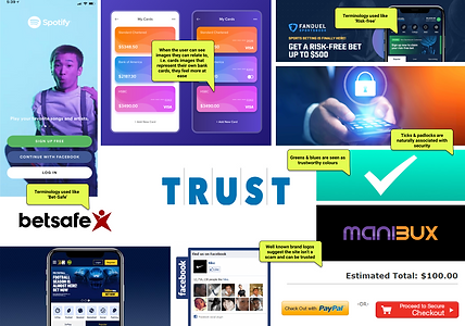
I also began to look at real life examples of typography and colour palettes that might suit these brand guidelines and that I could use within my own app...
Click on the below documents to view my findings in more detail...
-
Playful typography
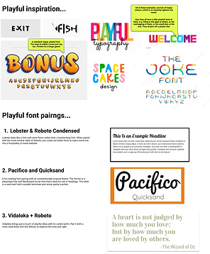
-
Clear typography

-
Trustworthy typography

-
Colour inspiration

From analysing the moodboards I was beginning to get a picture in my head and a style that I was leaning towards.
2. BRAND STYLE & PATTERNS
The picture I was beginning to put together was a modern day bank, with a cool and funky feel to it, but not over the top as it's still a banking application, dealing with people's money, so it still needs to be taken seriously.
Here the concept of 'VIBE' bank was born.
I developed a logo to portray this funky & cool vibe, with a sense of fun, ease and excitement in checking one's personal finances. This was embodied with an electric pulse, sound wave style image running through the VIBE text.
I also created an accompanying colour palette using colours that also fitted this idea. I think the pink/purple contrasted perfectly with black & white for that funky, yet classy feel.
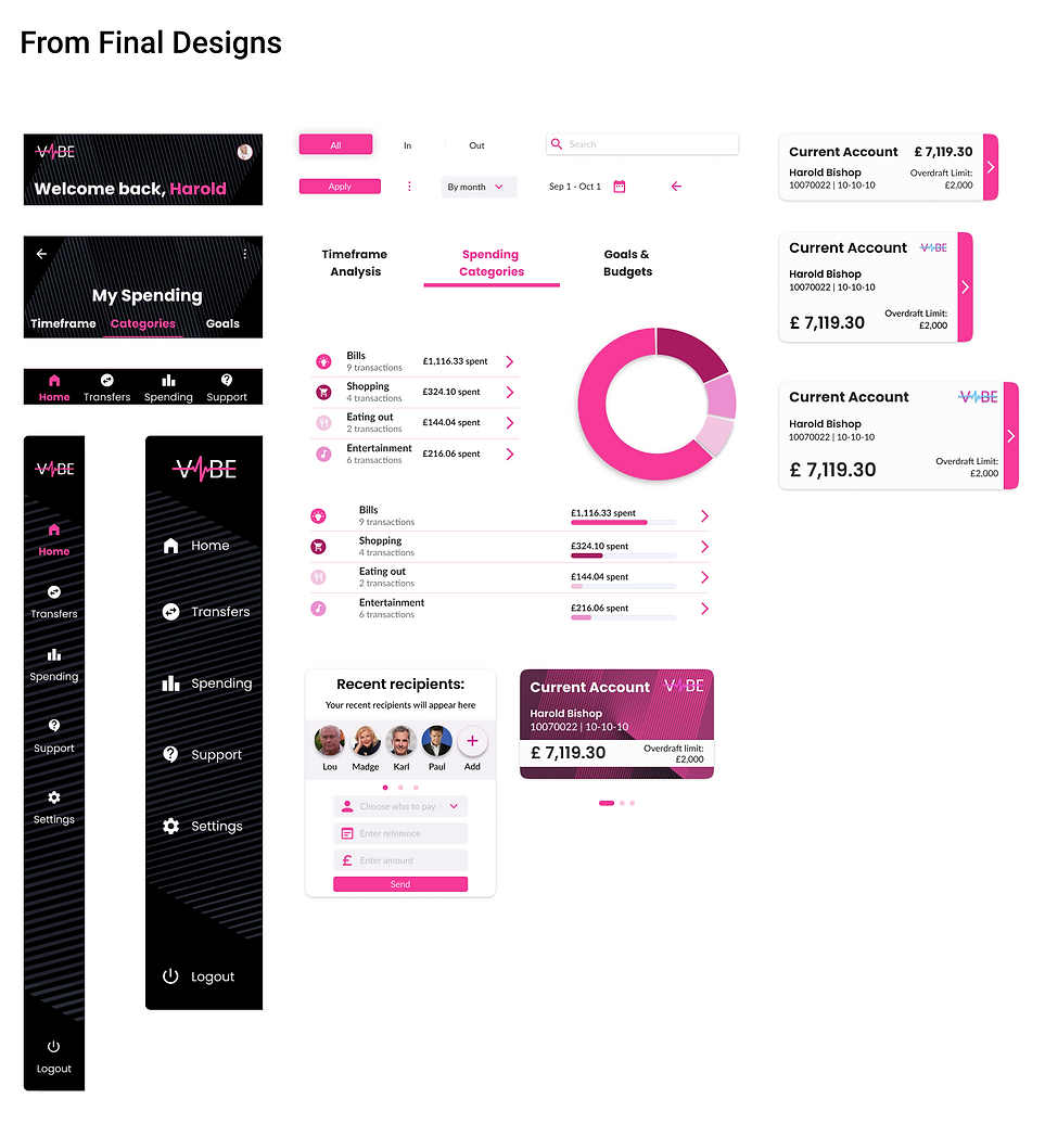
Initial designs and pattern explorations shown below were further refined into a finished type scale, colour palette, matching logo and visual system.

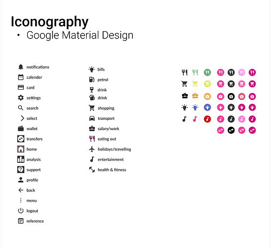


3. DESIGN - WIREFRAMES & HI-FIDELITY
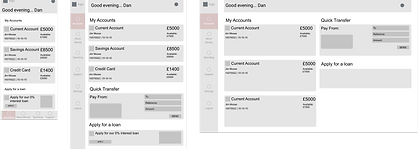
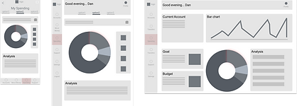
Of course before all of the UI & visuals could be created I first had to create my responsive lo-fidelity wireframes for the 3 device sizes, mobile, tablet & desktop.
See below for an example of these...
-
Example of 'My Account' wireframes


-
Example of 'Main Screen' wireframes
-
Example of 'My Spending' wireframes
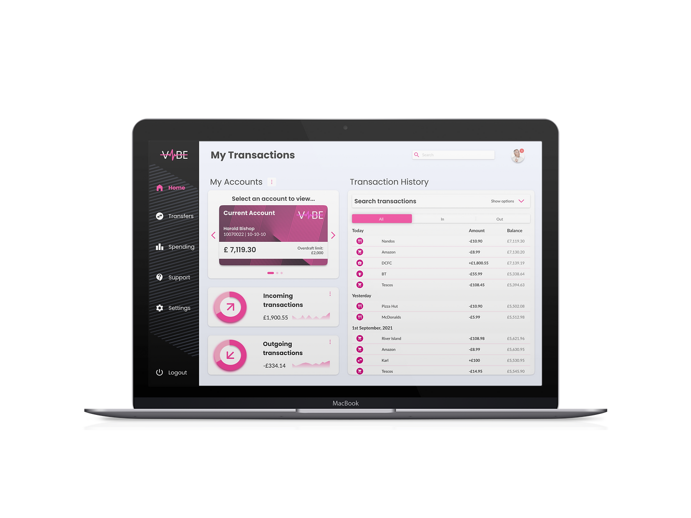
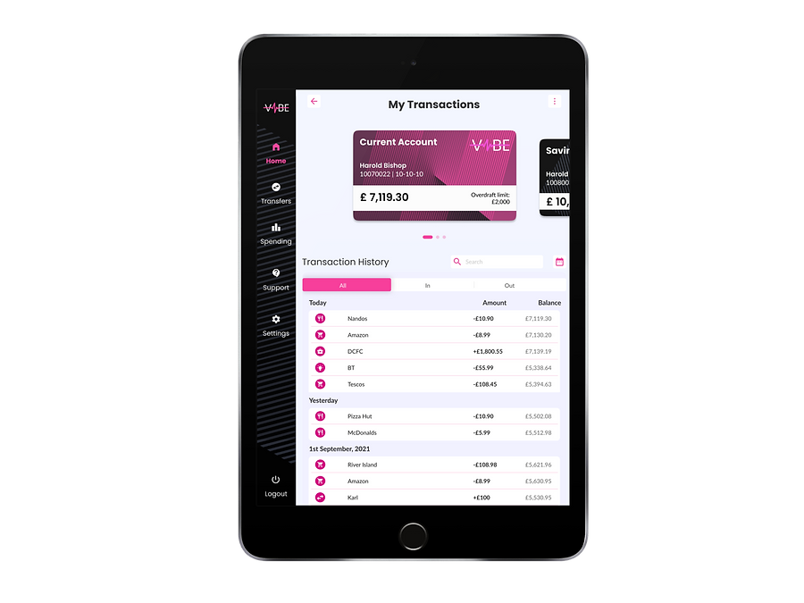
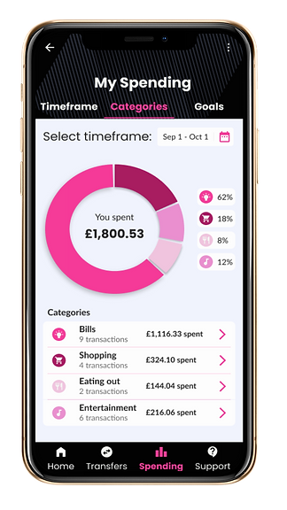
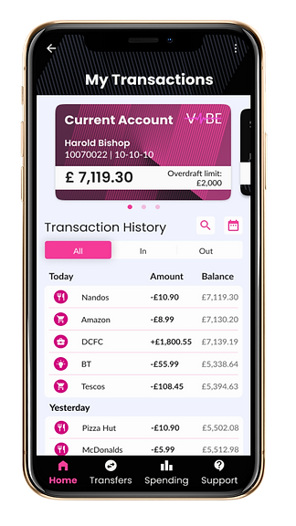
The final hi-fidelity mockup screens included a main screen/dashboard, account overview & spending analysis screen. They were all designed responsively for desktop, tablet and mobile.
I next went about converting the native mobile wireframes to their new responsive web versions for each of the different game areas and mapping out the user task flows.
I used Balsamiq to do this as it's a good tool to focus on structure and content, I didn't need to worry about the cosmetic and visual side of things until later.
GOALS...
-
Try to keep the same UF look and feel in relation to layout (if possible), as to not confuse existing users too much
-
Keep the same available functionality & features for each screen
-
Remove any mobile specific UI and replace with a generic format suitable for web
-
Create user task/flows with the web wireframes
See below for some examples of these...
-
'Game Lobby Area'

.png)
Hi-fidelity versions of 'Main Screen'
Hi-fidelity versions of 'Account Overview'

.png)
.png)
.png)
Hi-fidelity versions of 'Spending Analysis'
.png)
.png)

3. SUMMARY & REFLECTION
Overview
I feel my final designs matched all the client’s required brand values, playful, clear and trustworthy. Though of course, as with any client project there were some difficult issues to overcome let’s take a look in more detail at the positives and negatives.
What went well?
As I said I think I stayed in line with the 3 brand values of the client.
-
Playful - I think the shade of pink used gives a fun and friendly vibe to the application and also some of the images like the piggy bank & present box in the offer tabs add to this feel.
-
Clear - The font combination of Poppins & Lato worked well, as it was friendly but also kept the right amount of seriousness to display financial data. I also feel the strong use of typography hierachy made everything clear to the user.
-
Trustworthy - I didn’t want to use too many images, bright colours or fancy shapes, as it would be over playful and would be like a circus, which would not be trustworthy! The black & white colours used with the ‘fun’ pink work very well together to portray trust.
After trying numerous colour palettes, names and logos, I was really pleased with my choice of brand identity, ‘VIBE’ bank.
I feel all aspects involved (colours, typography, logo) get across everything I wanted...
"it’s a cool, funky bank with a modern feel to it."
I was pleased with my use of Figma’s auto layout feature, I tried to use it as much as I could throughout the project. Initially getting to grips with it was tricky, but I watched a lot of videos and made a point to stick with it wherever possible. This definitely paid off when creating repetitive components like the transactions rows and if I needed to quickly add a different icon or adapt them for the different screens sizes.
I felt the whole design process from converting the initial wireframes to the final hi-fidelity mock-ups went well without any problems.
What didn't go so well?
As I got further into the task and especially nearer to the end of it, I began to think more about the UX side of things. As this was a UI/visuals project I probably didn’t give enough thought to the overall information architecture and structure of the application, I was only interested about the screen designs. For example, how would the user access screen X from screen Y, etc, etc?
What would you do differently if you had unlimited time?
1. Create a proper style guide and(or) design system where I could easily grab what I wanted without searching through all my assets.
-
Could include colours, icons, typography scale, layouts, images
-
UI components all scaled for different screen sizes, etc
2. I would’ve made the screens into an interactive prototype in Figma...
This would’ve displayed how the interactive states for things like buttons would work, e.g. hover, selected, unselected, etc
It would clearly show how the screens are connected, how the user gets from A to B
3. As previously mentioned I would have put more thought into the whole information architecture of the application from the start and planned the structure of everything and then of course, I could make the WHOLE banking application if necessary.