
MY ROLES(S)
-
UX/UI Designer
PROCESSES
-
Information Architecture
-
Wire-framing
-
User task flows
-
Lo & Hi Fidelity Mockups
-
Prototyping
DATE
-
June 2022
BACKGROUND
-
UltimateFan, (UF), is a free-to-play fantasy football game, which brings fantasy together with pack openings, think FIFA meets fantasy football, i.e. the pack drops, with standard FF mechanics.
-
Launched ahead of the 2020 Euros, the game became popular amongst football fans across UK & Ireland through innovative gameplay and huge cash prizes up for grabs. The success of the round-by-round Euros contests led to the launch of the PL edition of UF, followed by multiple NFL editions for North American ‘gridiron’ fans.
-
UF v3.0 is scheduled ahead of the 22/23 season, with exciting new functionality to increase fan engagement and the unprecedented integration of NFT coaches to completely disrupt the market!
-
It is currently available free on the iOS (App store) and Android (Google Play), the web version is soon to follow.
PROJECT BRIEF
-
The most popular fantasy football games on the market, e.g. official FPL & Sky Sports boast native mobile apps, but also have web based versions of the game. This gives users the opportunity to access via a laptop for example and have a more intense team management session.
-
Ultimate Fan was initially designed as a 'mobile first' game and so was missing a web version, but with all the new features planned for v3.0, it needed one ready for the upcoming 22/23 season.
-
My task, create responsive wireframes, user task/flows in Balsamiq for all the original v2.0 features.
-
After discussions and iterations with stakeholders convert to hi-fidelity Figma mock-ups ready for handover to front end devs for development.
-
Once v2.0 is complete, integrate v3.0 features, e.g. marketplace, wallet, NFT coach, trading.
TOOLS
-
Balsamiq
-
Figma

STEP 1 - Wireframing & user flows
As the existing UF native mobile apps had already been fully wireframed out, I was able to use these to base my web app designs on. It would be a case of converting these into suitable mobile, tablet and desktop versions that would adjust for whatever device they were viewed on, i.e. responsive.
I now had wireframes and fully mapped out user task flows for all the main areas of the game...
1. Signup & Login
2. Onboarding
3. Squad Management
4. Transfers
5. Leaderboards
7. User & Mini Leagues
8. Profile & Help
9. Packdrops
See below for some examples of these...
-
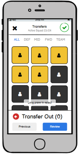
Examples of existing native mobile app wireframes


-
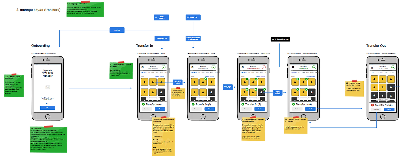
Example of user task/flow for transfer feature
I next went about converting the native mobile wireframes to their new responsive web versions for each of the different game areas and mapping out the user task flows.
I used Balsamiq to do this as it's a good tool to focus on structure and content, I didn't need to worry about the cosmetic and visual side of things until later.
GOALS...
-
Try to keep the same UF look and feel in relation to layout (if possible), as to not confuse existing users too much
-
Keep the same available functionality & features for each screen
-
Remove any mobile specific UI and replace with a generic format suitable for web
-
Create user task/flows with the web wireframes
See below for some examples of these...
-
'Game Lobby Area'


Noticeable Adjustments
-
The mobile style footer bar was replaced with a static web style header bar.
-
This was also done with the v3.0 features in mind.
-
The drop down profile menu was removed and given it's own page.
-
'Squad Management'


Noticeable Adjustments
-
Squad tray was moved from bottom of screen to the side of pitch.
-
This made for better viewing and also easier to scroll through players and search with the constant open 'search' field.
-
'Player Card'
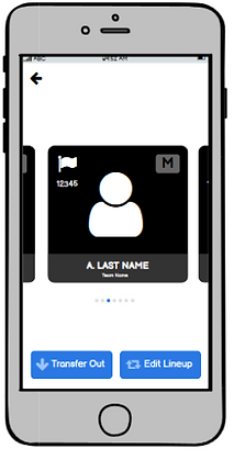

Noticeable Adjustments
-
Player cards were made to appear in a popup with arrow CTAs, rather than a long scrollable carousel.
-
If modals or popups could be used, I thought it was best rather than create a whole new screen.
-
This did present a problem, as I was unsure how the 'tap' screen functionality on mobile could be replicated to flip the card, so I added 'flip' & 'Close' CTAs.
-
However, after discussing with the developers I was assured this wouldn't be a problem.
-
Example of user task/flow for squad management

STEP 2 - High-Fidelity mock-ups
To convert my wireframes into high-fidelity mock-ups I used Figma.
Again I had a number of goals...
-
Try to keep the same UF look and feel in relation to visuals, this includes...
-
Colour palette
-
Typography
-
Icons
-
Images
-
-
Create a basic style guide that would help in trying to keep all the screens throughout the app consistent.
-
Create a component library in Figma for frequently used objects so changes can quickly be implemented throughout, e.g. header & status bars, CTA buttons, modals & popups
-
Create user task/flows with the high-fidelity screens
See below for some examples of these...
-
UF Style Guide
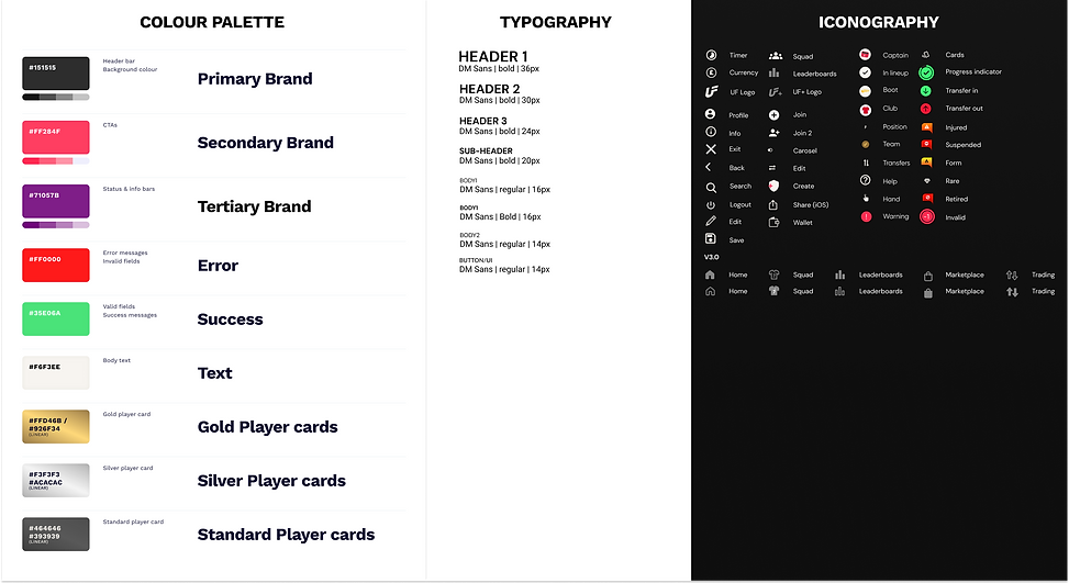
Notes
-
The mobile apps were created using a not so easily accessible font and I thought this may cause issues when creating a web version.
-
I decided to use a simple web font that there would be no issues accessing for different users, browsers, etc. i.e. DM Sans

At last the end was in sight! I worked very closely with the front end developers to spec out any missing interactions, components or flows that were not covered or were missing from the high-fidelity mock-ups (yes it does happen, nobody's perfect!).
I conducted a UX review of each front-end screen that was implemented to ensure it was aligned with the designs.
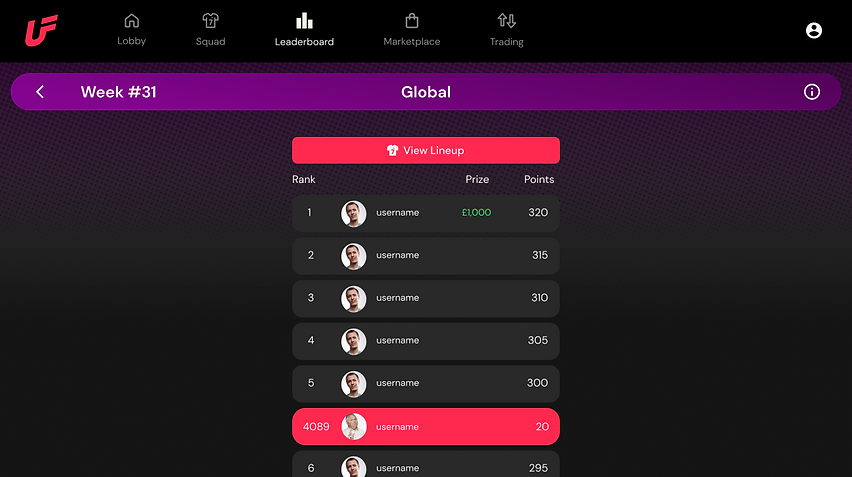
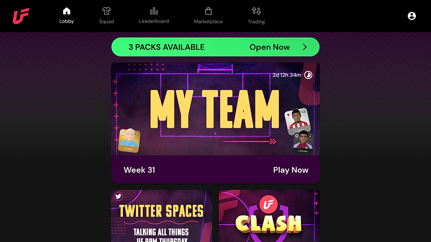
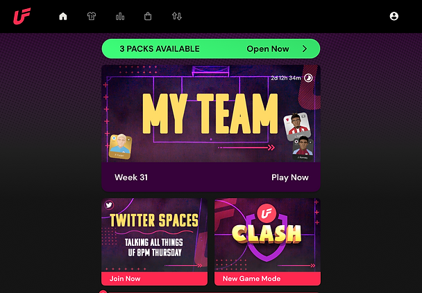
See below for some examples of the final mock-ups and how the screen responsively adapts to the specific device size...
'Game Lobby Area'

'Squad Management'


'Competition Leaderboards'